Ok, so I'm sure we've all heard the phrase "don't judge a book by it's cover." However, the cover is an excellent judge of a book! Often, they give you enough information about what type of book it is so you know whether it is or is not something you want to read: not by the title, but by the imagery on the front.
Covers are a very important part of a book, and I'm not meaning physically (as that's obvious), but in terms of aesthetics and peaking your curiosity about the book. How many times have you decided to try a book because it's cover intrigued you? Or, how often have you decided to put a book back on its shelf because of the cove? A good cover gives you just the right amount of information, while also withholding enough information, to give you an idea about a book without giving it away entirely. It's not just about what information to give the potential reader either, but how to portray it so as to grab your attention and keep you intrigued enough to give it a try. Ever decide not to read a book because the cover was boring? I know I have, just as I have books I want to read, at least in part, because of the covers. So without further ado, here are ten books whose covers make/made me want to read them:
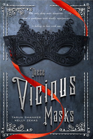
1) 'These Vicious Masks' by Tarun Shanker:
This is a gorgeous book cover! I love the simplicity and elegance of it. The fancy masquerade style mask with the red ribbon that catches your eye, the beautiful (yet readable) font, and even the choice of colours. All the little elegant detailing don't just look pretty, but they reflect that this is an historical fiction. And the mask, well, who doesn't find a mask intriguing? 'These Vicious Masks' is a combination of historical fiction meets X-Men.
2) 'Scarlet in the Snow' by Sophie Masson:
I love the subtlety of this cover. The choice of showing a red rose on the front was not just beautiful and indicative of the romance of the story, but also smart as the rose is a nice subtle nod towards the fairytale this is a retelling of. 'Scarlet in the Snow' of the Russian fairytale 'The Scarlet Flower' (Russian version of 'Beauty and the Beast') and 'Fenist the Falcon.'
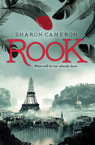
3) 'Rook' by Sharon Cameron:
I loved this cover, and, having read it, I loved this book (review to come eventually)! Again, I love their choice of colours for the cover. The more subdued, mono-tones that really help reflect the Dystopian setting of the book, offset by the red of the title and the tip of the feather (which is rather important as the main character is known as: 'the Red Rook'). Besides reflecting the 'code name' of the main character, it is also an homage towards the classic story 'The Scarlet Pimpernel.' I absolutely loved this book; the gorgeous cover did not disappoint me, the book was just as great!
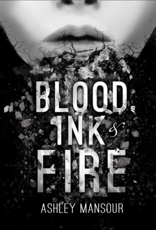
4) 'Blood, Ink & Fire' by Ashley Mansour:
Like most of the books on this list, I've not tried this one yet, but the cover just intrigues me! The choice of a high contrast, black and white cover really makes it stand out, and covering up most of the face just adds to the mystery. 'Blood, Ink & Fire' is a Dystopian scifi/fantasy novel reminiscent of 'Farenheit 451' by Ray Bradbury where reading and books are forbidden.
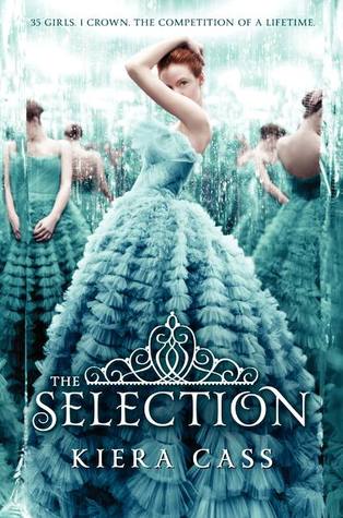
5) 'The Selection' by Kiera Cass:
Gorgeous cover! Again, I've not read this yet (hard to even get a chance to with out often it goes out of the library!), but this cover is what first caught my attention. I love how they chose to use only one colour on the front. The varying shades of just a single colour is very eye-catching! (Ok, so if you haven't guess by now, I have a Fine Arts degree, so colour choice and composition really resonate with me.) Also, the way the central figure is staring out at you while several others, of the same person, are somewhat mirrored in the background just really gets your attention, and I think, reflect well the fact that this book is basically about a beauty pageant. 'The Selection' is a semi-Dystopian romance.
6) ' Mechanica' by Betsy Cornwell:
'Mechanica' is a good example of a book with a gorgeous cover, that, in my opinion, ended up being a bit of a let down. I loved this cover! (The premise of the book was also quite interesting). The Steampunk font is gorgeous, and the way the gears are incorporated into the landscape was also pretty cool (and don't get me started on the mechanical bugs flying around her! I love Steampunk bug sculptures, and have made a few myself.). Everything about this cover just made me want to read it, sadly, having done so I found it a bit disappointing. 'Mechanica' is a Steampunk Cinderella retelling, for me though, I found the story to be rather lacking, the writing was just blah, and the ending lack-lusting.
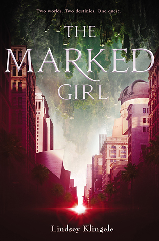
7) ' The Marked Girl' by Lindsey Klingele:
This is a really intriguing cover! The choice of complementary colours really makes it eye-catching, but what really peaks my curiosity is has two different landscapes/worlds shown! The the city-landscape at the bottom and sides, and the beautiful natural landscape descending into it. This duality of the cover, reflects the story's premise very effectively and really peaks your curiosity! 'The Marked Girl' is an urban fantasy involving a fantasy/magical world and the modern-day real world. Sadly, it has not been released yet so I (and you) have to wait to read it. It comes out June of this year.
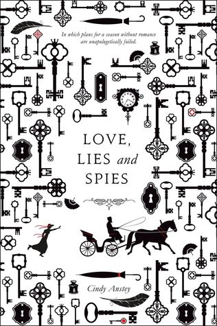
8) 'Love, Lies and Spies' by Cindy Anstey:
Not entirely sure what it is about it, but this cover just really catches my attention. Maybe it's the simplistic nature of the black-and-white silhouettes, or the fact that I rather like keys, but I just love this cover and think it fits the book's premise really well. What better way to illustrate a period spy mystery/romance than with ladies fans and keys promising the unlocking of secrets?
9) 'Storybound' by Marissa Burt:
I think this is just a cute cover. A book about going inside of a book with a cover made to look like a book of old fairytales? Love!
10) 'Rebel Mechanics' by Shanna Swendson:
This is just a very nicely done cover. It reflects the historical setting, with just a hint of Steampunk thrown in with that hanging gear on a ribbon. It doesn't tell you much, but it tells you enough.
These are just a few of the books that I could list here! I could easily list more, but then this blogpost might never end. However, 10 beautiful book covers is enough for now. Hope you enjoyed this post and don't be surprised if I share more book covers later!




No comments:
Post a Comment